Reality can be bleached by the news tickers and the 9-to-5s and the endless pile of pills that cry out to be juggled. And then you see it: that flash of color. The shapes, stroke and gloriously blended gradients that soak into that bleached timeline to remind us that there’s more to live than the ticking hands of a clock.
Sarah Petrucci is an artist and graphic designer from right here in our own little kingdom. Her work is, in this writer’s opinion, transcendent and inviting to that transcendentalism. She works in multiple media, and she’s here to brighten your doorstep.
I sit with Sarah and we talk about practical sorcery.

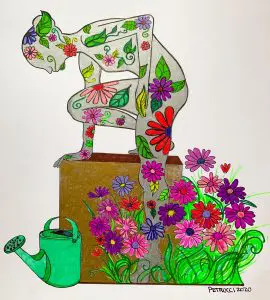
“Bloom”
14”x17” Ink on Bristol
“Passion creates, addiction consumes.”
RRX: I love covering art and music because of the similarities in the craft of each, and how they have so correlated an effect on the person taking them in. So let me ask a big question. A lot of artists and musicians have “that vision” or “that sound” that they chase but never quite catch, and they create along the way. What is your big vision?
SP: I have been creating for as long as I can remember and had the compulsion before I knew what it was. Maybe it’s a bit cliché, but I remember the first time I saw Van Gogh’s “Starry Night” and Edvard Munch’s “The Scream.” I was in the 4th grade and couldn’t get over it…I wanted to memorize every brush stroke. It was the first time I “felt” art and realized that it wasn’t just about looking and seeing. That same year I attempted to execute that concept with a rather fearsome papier-mâché mask that my art teacher took a special interest in. She entered it in a statewide juried exhibition called the Imagination Celebration in 1992. I called the piece “Long Nose, Wooden Tooth.” My parents and I attended the reception at the NYS Museum and I vividly remember the stark white walls exploding with art. I knew in that moment that I was an artist and that’s what I wanted to do forever.
I kept my creativity close and used it as a coping skill during my tumultuous teenage years, graduating from high school early to attend art school at the Sage Junior College of Albany. I wanted to find the “real artists,” and back then it felt as elusive as finding a unicorn. I studied with Willie Marlowe, Garry Shankman and John Hampshire all of which influenced me exponentially; Marlowe in particular. I had never met a woman painter. Her work was all about color, intense close valued color, neon color, deep color-textural color all the time; sometimes straight from the tube. She encouraged every wacky notion I came up with and even allowed me to implement my own “independent study.” I created glow in the dark paintings, paintings on wood, metal and glass, and a series of paintings on car doors I ripped off of a 1978 Volvo, called “Vehicle of the Mind.” She challenged the notion of what “fine art” or high art was made of and I was obsessed. I’ve been chasing that vision ever since. In the words of Andy Warhol, I believe “Art is what you can get away with.”
RRX: Some say it’s all about the tools. Most in the know would argue that the tools in uninspired hands don’t amount to much. But in inspired, trained hands, the tools take on their own life. You work in visual, so what do you like, in terms of different media, and different brushes, pens, charcoal, etc.?
SP: There are many tools in my toolbox and my approach is playful! As a graphic designer, my biggest tool is the Adobe Creative Suite, Photoshop and Illustrator mostly. In terms of painting or drawing, few things are off limits. Some of my favorite mediums include Liquitex acrylic and spray paint, ink, and Sharpies. I’m obsessed with Sharpies…the precision and permanence, and the colors they are coming out with are awesome. There are always at least a dozen of them in my purse.
RRX: Art and music both have two natures, or aspects. Both can exist live, or “in the wild,” and they can be preserved in some way. In both, there’s live and recording. What do you think is different about a live, physical sketch or painting and the digitized version? Is it even better to present a work as digital only?
SP: The distinction between a physical sketch and the digitized version is similar to live music versus the recorded version in that digital work is usually much more refined. Mistakes can be corrected and polished. For me, the beginning is always the same; everything starts in my sketchbook. Whether that sketch evolves into something digital or not is another story. I don’t think it is better to present work as digital only. With my design clients I always share my preliminary sketches; they are a part of the process. In the same way live music is raw, honest and full of soul, so too is “art in the wild.” I can’t imagine Pollock creating his splatter paintings digitally. I believe there is tremendous value in the process of creating art, and that process possesses equal importance to the final product.
RRX: You are a graphic designer. I wish I was. I know from work I do in this publication that graphic design is sometimes a delicious torture. How did you get into graphic design? And for someone like me, who probably wouldn’t score a scholarship anywhere, how can I get to a working understanding of graphic design?
SP: Delicious torture indeed. I never imagined I would get into graphic design! When I was a fine art student there was a rivalry with the design majors…a real us versus them attitude. The fine art folks were accused of being lazy and messy, while the design people were mocked as “sellouts” for being commercial and considered up-tight, compulsive and deadline oriented. I wanted no part of that! I was a perpetual student and was working as a police dispatcher for the city of Rensselaer. That job was not for me to say the least! It took a decade of repeatedly dropping out of school, trying again and again, until I found an online graphic design program at the Art Institute of Pittsburgh. I was desperate to finish…something. I couldn’t see myself making a living with art alone, had little interest in teaching and couldn’t swallow being condemned to a life of emergency services, so I decided I would try. I enrolled in 2013 and FINALLY earned my bachelor’s degree in graphic design in 2018 while working full time. My goal was to happily compromise…not all graphic designers are “artists” and not all artists are graphic designers but the aspiration was to incorporate and overlap the two into the creative career of my dreams.
My advice on gaining a working understanding of graphic design would be not to bury yourself in student loan debt like I did! My degree program was very challenging and had an 11% graduation rate. It involved a lot of independent learning. I knew I wouldn’t have the discipline to teach myself without the pressure of getting a grade. If you have the patience and tenacity, you can definitely teach yourself! YouTube has changed everything. Many resources and tutorials are available through Adobe and Lynda.com as well.
RRX: Following up on the last question, graphic design. This world is governed by design. Advertising, architecture, the placement of junk food in end-caps at the supermarket – it’s all design. As an artist, do you ever feel you need to break a design/function barrier in your work, or is it better in the long-run to follow the rules, but maybe bend them?
SP: I’m a firm believer in learning the rules before bending them and that is where art and design differ. Art can be just for art’s sake. Art can be a banana duct taped to a wall.
Design has function and rules are important because the human brain is wired to see structure, logic and patterns. Both are attempts to understand and describe the world around us. The subjects and methods may have different traditions, the intended audiences can be different, but I think the motivations are fundamentally the same. I don’t like to regard design vs function as a barrier but as an opportunity to embrace both and solve the problem as eloquently as possible.
Author
Staff
You may also like
Continue reading


 RadioRadioX