The Universe Between the Lines: Interview with Nikkol Jelenic –By: Liam Sweeny
Written by Staff on April 8, 2022
 We once had gods, and they were fierce, and they were mighty, and they were like us, and then we organized, and the old gods gave way, but never the need in our lives for something that could represent the potential of our imaginations. And so, one day an artist drew lines and a writer wrote words and it was like peanut butter and chocolate – comics, and superheroes, were born.
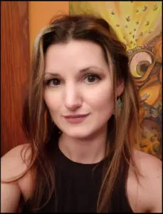
Nikkol Jelenic creates heroes. To be more accurate, she also creates villains. Heroes and villains, and once in a while, through sleepless eyes, she creates nightmares.
I sit with Nikkol as she draws my portrait, and we talk.
RRX: Comic art is different than abstract art or still life; it tells and advances a story, and it does this in a very physical way. It’s a capture of the kinetic energy of a moment of an event. When you’re capturing this event for that story, do you step back to think of things in terms of abstracts and concepts, or is it like seeing lines in your head?
NJ: I agree that those art forms are very different in the aspect of comic art being more about visualizing the action of a story. Comics can be compared to a detailed version of a storyboard for a movie. When designing the layouts, I like to imagine what the coolest camera angle would be to depict those moments in the panels.
RRX: Comics are an arranged marriage of artwork and writing. When you’re creating a scene, you need to make room for the thought bubbles or the dialogue bubbles, and this must affect how you draw it out. Have there ever been any personal heartbreaks where you had to block some really great artwork because of the needs of dialogue?
NJ: It certainly does! I learned that the hard way, having an editor inform me how difficult it was for the letterer to find placement sans much negative space. I’m quite mindful of that now. As far as heartbreak, I do feel it when I’ve chosen to lay areas for dialogue, I thought obvious and the letterer thought to go elsewhere.
RRX: You’re an amazing artist, and you’re versatile. It must make comic book writers want to write to your style. But that brings up a (hopefully) interesting inquiry: how does a writer write to your style? It’s like asking how you pair a Robert Frost with a Picasso, I guess, but how does a writer present work that your art would be best for?
NJ: Appreciate your kind words! I have had most writers that I’ve worked with create the works for us to cater to my style, but more so to the content I enjoy drawing. I feel it’s all about inspiration. What the storyteller creates has a vision initially and that can come from being inspired by imagery seen beforehand. A writer may see something I’ve drawn and that could plant the seed of a really cool concept for a tale that we can grow together.
RRX: You’re really into horror comics. And what I’ve noticed about your work in that genre is that there might be a color convention, maybe a ‘horror palette,’ very black and white and red, muted earth tone colors, very indicative of human blood and gore and the night. But you add a lot of color ‘splash’ to it. What started you with that?
NJ: It is rare that I do interiors for anything other than horror, as it is my favorite subject matter, but I do enjoy drawing and reading other genres. I love to paint, and the allowance of color variety is quite fun. The color portion of any art form is just as important as every other working part of the project. I love color and especially vibrant tones. Darker tones, shadows and tints are great, too. Color can really have the viewer feel the moments they’re taking in as well as explain scenes visually, so the writer doesn’t need the letterer to explain scenes excessively. Like, the time of day, locations, character emotions, etc. I do enjoy a good ‘horror palette’, but vibrant colors that are used successfully can be such eye candy. The colorist loaded up the coloration to a recent book I did that has heavy floral and botanical imagery. I think this brought more life to the story and art than using a more traditional color scheme found in horror. It just depends on the content of the story for which direction the coloring should go.
RRX: You’re involved in a lot of independent stuff, independent comics. Some of your work is in Aftershock Comics. As a writer, I’m acutely aware of the difference between indie publishing and a more corporate publishing. But I don’t know jack about the indie comic world. What would you say are the pros and cons vs. say Marvel or DC?
NJ: I personally have yet to have an experience to present a con for either. I do love that indie stuff allows creators to feel limitless with their works. I’m just happy to be illustrating fun stories for whoever will have me along. Collaborating with writers is most enjoyable because I like the communicating and building with other creative types. I also make my own comics, which gives me full free range. And that’s a very proud feeling to hold your own little baby, printed in hand, that you poured your soul into.
RRX: One thing that everybody knows, and has an opinion about, is the human form as portrayed in comics. I’m talking the generally svelte basic form of a superhero. I think we’re starting to see more everyday kind of heroes, but with a more diverse range of body styles being represented, is it harder to capture that kind of motion in pen and ink?
NJ: That’s what I enjoy about indie comics the most. Great to see regular people existing in the world. I love me some super jacked up supes and bodies in armor of the gods, but people you pass in the streets have the potential to do big things and be part of intriguing stories also. I like to draw all body types, but I’ll take monsters over any of them. I don’t think one body type is more difficult than the other, rather equally as difficult to master without practice. I learn new techniques and find new angles, when drawing bodies, every day that I am working on something.
RRX: This is where you answer the question I didn’t ask. Favorite place to catch an ink stain? Pen erasers that actually work? Educate, enlighten, emote – the floor is yours.
NJ: Ink stains suck! Hahaha! Actually, I rarely ink as I’m usually hired as a penciler. My sketch paintings are where you’ll find most of my inks and there is where I catch ‘stains’. So, for a fav, I like when the ink stays on the paper instead of staining my fingers. I don’t usually use ink erasers because I like wherever it decides to land. I keep the sketches pretty chaotic and throw the ink around on them with a paintbrush. We live in a super digital world so any cleanup can be addressed in photoshop. Electric erasers are pretty cool to try out. My advice is to try it all!


 RadioRadioX